Elevating blog aesthetics
Today, I took significant strides in transforming the visual appeal and usability of my blog. Initially, the blog’s archive and tag sections were simple, raw links with no styling, a straightforward yet uninspiring way to navigate. Recognizing the need for a more engaging and accessible layout, I embarked on a journey of CSS enhancements.
The starting point
The blog began with a basic layout:
- Archives and Tags: Simple hyperlinks with no visual differentiation.
- Blog Posts Listing: A list view with minimal spacing and no distinct sections.
Transformation journey
Leveraging the power of CSS, particularly flexbox, I introduced several key changes:
- Flexbox for Alignment: Implemented
display: flex;within the blog section rows, ensuring a clean, aligned presentation of blog posts. - Equal Height Containers: Adopted flexible containers for blog posts to maintain equal height across each row, enhancing visual consistency.
- Responsive Design: Ensured fluid layouts on mobile devices by adjusting the flex basis, making each blog post container take full width for better readability.
- Aesthetic Enhancements: Introduced background colors, hover effects, and box shadows to blog posts, significantly improving visual appeal and user engagement.
- Typography Adjustments: Refined text elements like headers and links for better legibility and contrast, ensuring an optimal reading experience.
Visualizing the change
A before-and-after comparison highlights the transformative impact of these enhancements:
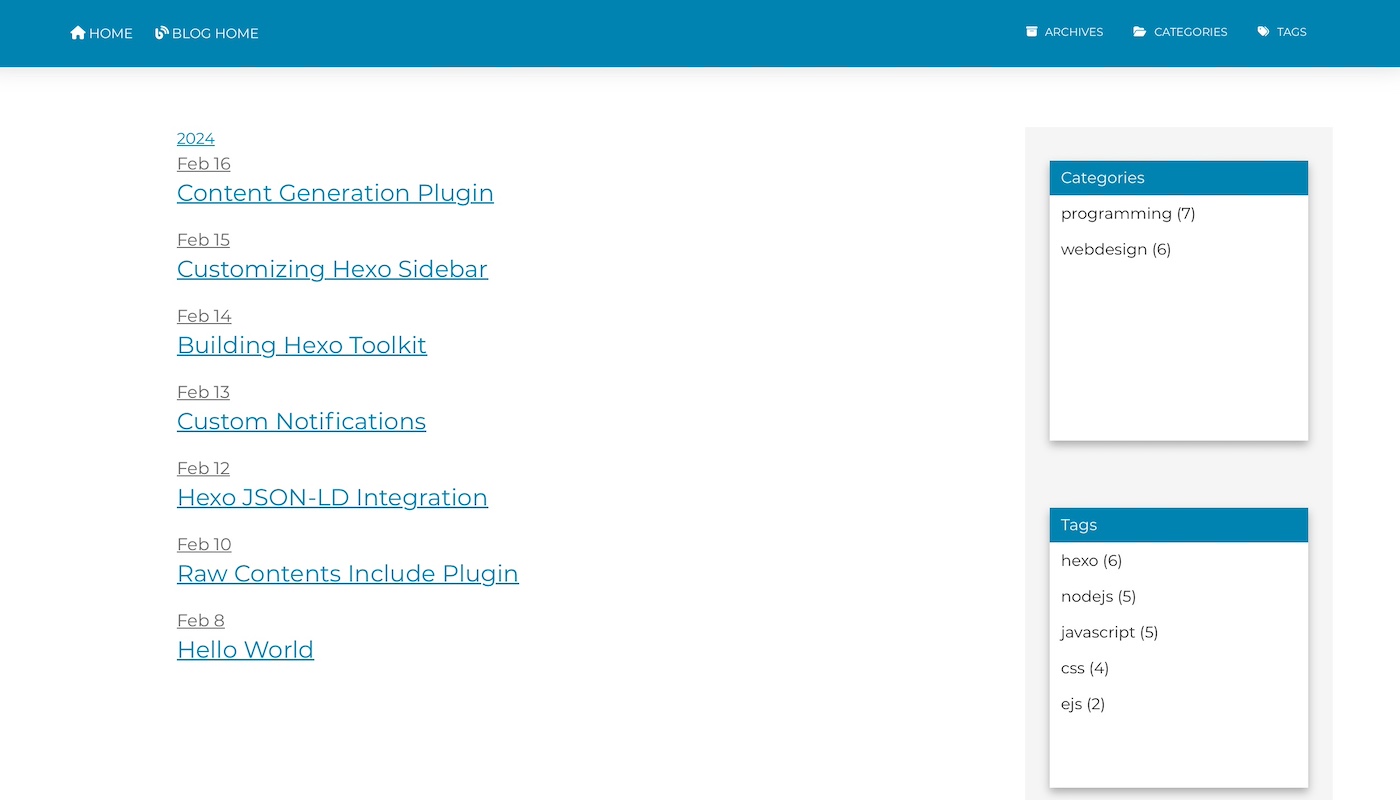
Before: A basic list of links.
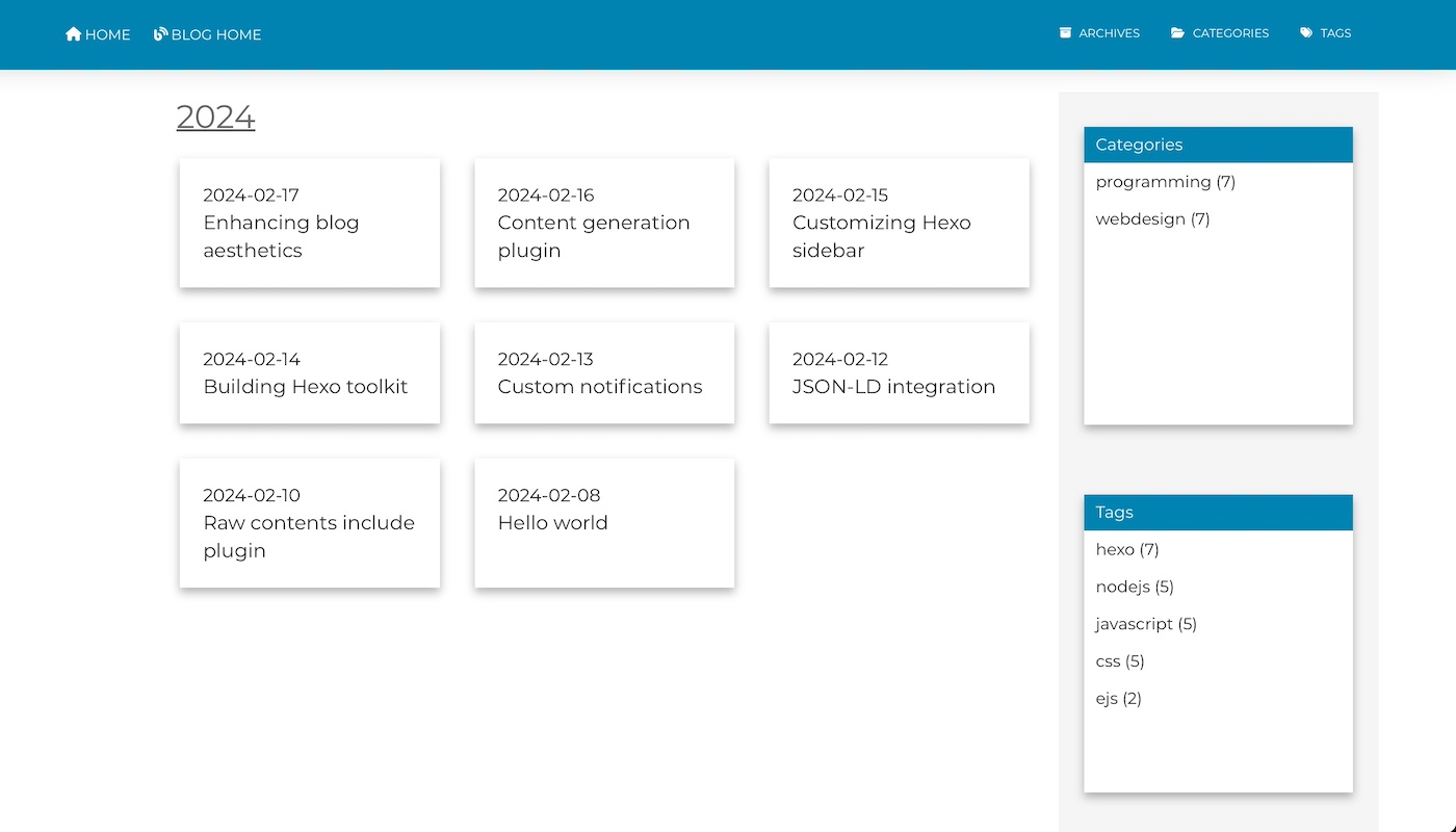
After: A visually engaging and structured layout.
Reflections
This journey from a no-frills link list to a styled, user-friendly layout not only improved the blog’s aesthetics but also its navigational efficiency. By embracing modern CSS techniques like flexbox and responsive design principles, the blog now offers a more immersive and accessible experience to readers, setting a new standard for content presentation in my blogging journey.